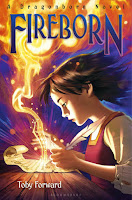
Every season seems to have its dominant graphic themes, as
designers do their best to drag us across the bookstore and make us pick up That Book.
 This fall, middle grade fantasy covers are calling us to the
light. Usually, it’s a blazing sky with one or more heroes either hurling
themselves into it or running for their lives. But who can say no to flashes of
lightning, glowing gizmos, or good old-fashioned magical energy?
 This fall, middle grade fantasy covers are calling us to the
light. Usually, it’s a blazing sky with one or more heroes either hurling
themselves into it or running for their lives. But who can say no to flashes of
lightning, glowing gizmos, or good old-fashioned magical energy?
I have to say, I like the fact that so many covers show boys and girls battling demons (or whatever) together and as equals. No more boys with swords, girls standing there looking scared. We're making progress!
Designers this fall also are fond of the “magical peephole”
technique, in which the solid plane of the cover is broken by a circular portal
to a fantastic world we want to see more of.
As always, some designers use a sprightly cartoonish style to reassure
us that all will be well. How bad can a zombie apocalypse be if it’s comic?
And then there are those who invent cool graphics to tell
their tale: The forthright Flora matched
with the flowing fonts of FLORA & ULYSSES, or the marvelously shifty
Alexander Baddenfield and his cat. Being a typeface fanatic from way back, I’m
drawn to THE CREATURE DEPARTMENT’s amazing alphabet.
As always, we’ve spread our parade of covers over two days. Come
back tomorrow for a content-oriented post: Dragons! Princesses! And, of
course, cats.
We’re featuring books published July-December, 2013. If we
overlooked an amazing cover, please link to it in the comments. And tell us which
cover is your favorite!
Click the link to see more covers . . .
I will face this scary flaming thing alone!
We two, drawn to the light . . .
Or running away from it . . .
Or letting it light a gorgeous steed . . .
Or just passing
through.
Who did you say you were again? The light's in my eyes . . .
Me, my friends, and . . . there’s that light again
Or maybe we're just lighthearted
Porthole to fantasy
Gorgeous graphics


Love these cover posts so much! Thanks, Ellen. Too much to love--I can't pick just one. :)
ReplyDeleteLook at all of those gorgeous covers! So many to add to the reading list! Thanks Ellen!
ReplyDeleteWhat a fantastic selection of covers again. I really think MG covers are getting better and better. How can anyone not want to read books that look like this?
ReplyDeleteI agree. I really do think the "glorious light" technique is effective, although I suppose it could get old after a while, as everything inevitably does.
ReplyDeleteI wouldn't mind some "glorious light" myself! :)
DeleteBeautiful! I always enjoy seeing these, Ellen - not to mention your ingenuity in showcasing them!
ReplyDeleteFound some titles to find out more about then. Cool post
ReplyDeleteLove Jenny Nimmo's. Great for adults with a sense of adventure as well as young adults. Highly recommended.
ReplyDeleteHyacinth
Have you seen your deliverance
Are you tired of being human, having talented brain turning to a vampire in a good posture in ten minutes, Do you want to have power and influence over others, To be charming and desirable, To have wealth, health, without delaying in a good human posture and becoming an immortal? If yes, these your chance. It's a world of vampire where life get easier,We have made so many persons vampires and have turned them rich, You will assured long life and prosperity, You shall be made to be very sensitive to mental alertness, Stronger and also very fast, You will not be restricted to walking at night only even at the very middle of broad day light you will be made to walk, This is an opportunity to have the human vampire virus to perform in a good posture. If you are interested contact us on Vampirelord7878@gmail.com
ReplyDelete