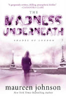
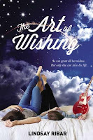
 Readers ask authors, “Where do you get your ideas?” I want
to ask cover designers the same question.
Readers ask authors, “Where do you get your ideas?” I want
to ask cover designers the same question.In this season’s crop of young-adult fantasy covers, designers used a variety of tricks to entice us: A dash of red, a quirky image, a complicated skyscape.
It’s
particularly interesting to note the two cases of duplicate book titles: In one
instance, the design approaches were similar, while the designers diverged a bit in
the second.
Every season has its dominant theme, and this time it’s gotta be the
Big Light, usually with characters silhouetted against it, often being drawn in.
(As the designers hope we will be!) It’s an effective device.
Like yesterday’s post, this one offers books published
between January and June 2013, for ages 12 to 18. If there’s one we missed,
please link to it in the comments.
Click “read more” to see the covers. Which one’s your
favorite?
Designer’s Choice
A Quirky Image Grabs the Eye
Run to the Light!
(Or away from it. Or just . . . I dunno, be it.)
Heads Up!
A Balanced Approach
Mirror Images
Big Sky
Big Words
Big Reds
Body Art
Embroidery
Let’s See Your Badge
What Lurks in the Mist?
Things Fall Apart
***
Ellen Booraem is the author of THE UNNAMEABLES, SMALL PERSONS WITH WINGS, and the upcoming TEXTING THE UNDERWORLD (August 2013). She lives in Downeast Maine with an artist, a dog, and a cat, one of whom is a practicing curmudgeon. She's online at www.ellenbooraem.com.


In this round, the Dance of Shadows cover really knocks my socks off. Also Far, Far Away (love that green smoke). And that Dead River cover is about the spookiest thing I've ever seen. (Probably won't read that one--I'm too chicken. But what an effective cover!)
ReplyDeleteYeah that Dance of Shadows one is really eye-catching -- the other two you mention as well. Also like that Xom-B City one, it's rather witty!
ReplyDeleteThere's some really beautiful covers in here and some really scary ones! I love the Zom -b City, Reboot and End Games covers - so funny the zeitgeist moments where you even have books the same title appearing in the same year!
ReplyDeleteMy lists of cover loves is too long! I love those Big Words covers so much. Also, Solstice is one I've loved for a while. Love her gonna-take-on-the-world stance. Both of those Vortex covers are striking, similar yet different. Mind Games, Copper Girl, Mila 2.0, City of Thousand Dolls,...!!!
ReplyDeleteYeah, I could go on and on.
Thanks, Ellen!
Oooh, and Time Riders! Love those goggles. :) Okay, I'll stop now.
ReplyDeleteLol--I know just how you feel, Lena!
ReplyDeleteThis is such a great post! Thanks for compiling all these covers. I don't think there's a single girl in a prom dress anywhere! (maybe Everbound, but it seems less of a focus) That ship must have sailed in 2012.
ReplyDeleteThere are so many great ones. Most of them capture my interest with the cover alone. They've done a really great job with them. And thanks for putting this together, I always love seeing so many gorgeous covers next to each other.
ReplyDeleteHow do book buyers for the stores ever decide between these fabulous works of art? They're all amazing. So are you walking around with your eyes bugged after researching this dazzling topic, Ellen? Great collection!
ReplyDelete